Dogwood rebrand
Dogwood rebrand
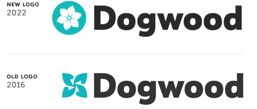
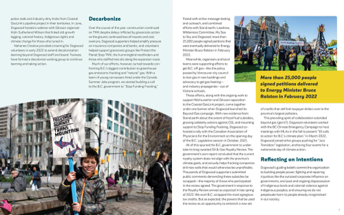

In 2016, I developed a new brand identity for Dogwood, who at the time had recently dropped “Initiative” from their name. It was vital that the accompanying new identity position them as a coherent, legitimate, formidable player in BC. Authenticity, confidence, inclusivity and being winners were key influencers for the design.
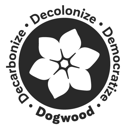
More recently, Dogwood developed a new strategic plan and goals: to decarbonize, decolonize and democratize through community organizing. The updated logo (2022) needed to better reflect these goals, which fit well in a 6-point dogwood flower with two petals for each goal. This a change from four to six petals was brought to the table by Dogwood based on a visual survey asking people to free-associate with flowers with 4, 5 and 6 points. The 6-point flower had the strongest association and least confusion compared with 5-pointed flower logos, such as the old BC Ferries logo.
Dogwood was looking to reinforce their power and efficacy as a people-driven organization, while creating something gorgeous enough for people to want to wear their swag (including a t-shirt, pins and socks). The result is a bold, energetic, kinetic and forward-moving shape paired with modern, approachable and solid typography. Two variants of this sophisticated but friendly typeface are used for visual communications along with a palette of several fresh colours, updated and expanded from 2016’s, that allow them flexibility to use the icon in different tones.


