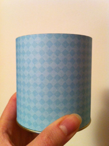
I had a tea container I couldn’t recycle, so I repurposed it with a strip of cute paper.
GOOD Magazine‘s latest contest asked for photographs of something repurposed and today they announced the winner, beautiful lamps made from glass bottles, by Lauren Lee. They’re stunning and blur art and design together, in the sense that she used essentially a readymade and added both intent and function.
Contributor Ivy Lane calls repurposing objects and materials “upcycling”, in stark contrast to downcycling, which typically refers to the deterioration of plastic as it undergoes multiple recycling processes. Repurposing is the ultimate sustainable thing to do with stuff that already exists. It extends its life, creates something new (our brains thrive on novelty, hence the rampant consumer culture), and inspires creative thinking to imagine objects being used for another purpose in new combinations. It’s easy to think of repurposing as taking something easily recyclable and giving it a new lease on life, but where it succeeds most wonderfully is in saving garbage-bound objects from an eternity in a landfill, bringing to mind the old adage, “One person’s trash is another’s treasure.” (Just check out some select submissions to see what I mean.)
I hope repurposing can find a home nestled between the handmade revolution and high design so as to appeal to anyone. In fact, there is no reason it cannot.
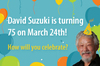 This daily green blog challenge is in celebration of David Suzuki’s 75th birthday, supporting the David Suzuki Foundation. Please help me out by sponsoring me online now.
Note: I am writing solely on my own behalf, and do not claim to represent the David Suzuki Foundation or its views here.
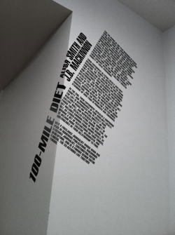
Last week I experienced the WE:Vancouver exhibition at the Vancouver Art Gallery. It’s one of the few shows I’ve seen where the gallery extends beyond art to include design and architecture, and they do it remarkably well. The fact that it’s all local (Jason lamented he didn’t make it in) makes it unique and more personally felt.
It did an excellent job communicating our cultural connection with nature through pieces like compelling manifestos by Alisa Smith and James MacKinnon, authors of The 100-Mile Diet, and the Vancouver Public Space Network; video and installation from the Downtown Eastside’s SOLEfood farm (psst! they’re screening Dirt on March 10); and eco-fashion goddess Natalie Purschwitz’s gorgeous outfits are displayed in photo and video. Other installations embrace our vibrant city and ideas as they focus on public spaces, food, and Critical Mass as they relate to Vancouver and its people.
Without giving away too much, the exhibit is a visual, aural and physical experience. It has its own gorgeous microsite as well, but don’t let it spoil your visit if you browse the site first, and photos are definitely no substitute!
Be sure not to miss Ken Lum’s trippy hall of mirrors on the second floor — take a friend in with you.
WE:Vancouver runs through May 1.
This daily green blog challenge is in celebration of David Suzuki’s 75th birthday, supporting the David Suzuki Foundation. Please help me out by sponsoring me online now.
Note: I am writing solely on my own behalf, and do not claim to represent the David Suzuki Foundation or its views here.
The colour-themed window display changed from blue to a startling black. This was no longer the time for a cheery yellow, or a come hither violet which announced itself in beautifully intricate illustrations. No, it was a display that suggested mourning: Kitsilano’s Duthie Books is closing at the end of February.
It is my daily dose of design inspiration on my way to work. The highlight of my short walk after a long bus ride. The surprise, the freshness — what will they think up next? or ooh, they are incredibly clever/thoughtful/creative! and gosh, that must be fun! (Perhaps I’ll take a page from their book — no pun intended — and rearrange my own every so often. But I will need more first.) I have enjoyed it day after day for over a year. I have even sometimes wondered if others watch me staring at the covers intently and ask themselves what could be so fascinating. And, as if they knew who was walking by twice a day, the staff put up design books one week and I felt giddy. I cannot think of anywhere else that has helped me discover so many interesting book covers — and potential reads. Design love aside, however, the rotating display is a highlight for many of my colleagues who are as heartbroken as I am to see it go.
Continue reading Duthie Books closing after 53 years »
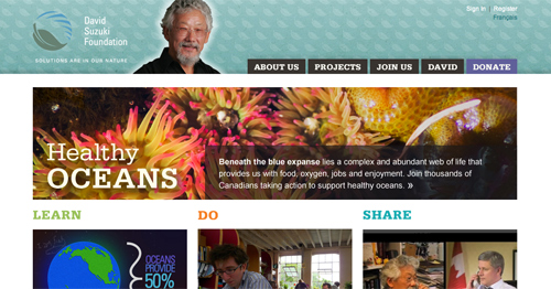
Our team at DSF has been working steadily for months to bring you a new website that lets you — people who care about environmental issues, sustainability, and health — share your ideas, questions, and stories about how we can all make a difference. The site also makes it easy to learn about relevant issues and take action in meaningful ways, big and small.
The design is a significant departure from our old site, which is cluttered and inconsistent. We’ve taken on a new strategy as well: most content is written to fit into either the Learn, Do or Share category, then pulled into project pages where relevant. This allows content to fit into two projects without duplicating pages, gives us flexibility when projects come to an end, and helps you get the freshest content. It’s a more accessible approach than organizing content around our programs, and avoids dividing complex topics like climate change into single issues. Everything is interconnected.
Continue reading David Suzuki Foundation launches new website, blog share »
Three years ago today, I started a blog at Blogger and didn’t really have a name for this new “thing,” didn’t know where it was going, and didn’t know precisely what to write about. I’m still writing about topics almost as broad as my own interests, and frankly, I don’t think I know much better where it’s going but at least it has a name: thirteen cent pinball.
About eight months ago I decided to upgrade my blog from Movable Type version 3 to the much improved 4. In the process, I wanted a wider page with larger font, bigger images, a cleaner and easier commenting section, and better typography. I wanted to eliminate extra steps and hurdles for users, and streamline my own process for updating content across the blog and eventually my portfolio as well.
Regular visitors will recall the blog originally looked like this:
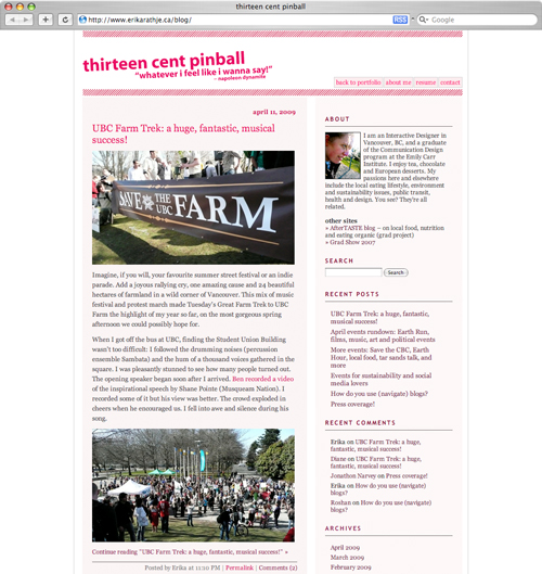
Continue reading New design launched as thirteen cent pinball turns 3 »
I’ve been working for awhile on giving my blog design a facelift. As tends to happen with design projects that are drawn out at length (as is the case when it’s not my full-time work), I know more at the end than I did at the beginning. I mean, yeah, that’s supposed to happen, naturally, with any project, but these ones that would otherwise be condensed into a short time frame take place over the course of months that are packed with learning that occurs outside their context. That learning tends to fall into either design (look at how much better I’ve become!) or programming (look at what I’ve learned how to do!). Sometimes it’s outside influences like new technology that didn’t exist before, or of which I did not know. Well, this time around, it’s not so much my visual skills or my technological skills, but my thinking that has changed and grown since I embarked on this miniature quest. And it’s quite, quite recent.
Blogs and websites are constantly evolving. As a result one can probably expect users to be evolving too — in fact, with the presence of RSS readers, we hardly need spend time on people’s blogs in our web browsers save to comment. User behaviour changes with technology. This is clear. So when I have a model for my blog that is almost 3 years old, I have to wonder… what is still relevant? What features do users actually use and how do they find information?
I googled this already but Google help me I didn’t find an answer. That, therefore, is where you come in. The question I pose you is: how do you use blogs? When you arrive at a post, what helps you move on to another post (assuming you enjoyed the content or found it helpful)? How do you navigate the information — through tag clouds, categories, recent comments? Are lists overwhelming or redundant?
Your feedback will help me determine what features are of most use to you when you read my blog. Thanks in advance for helping me out.
A side note: in its next incarnation, I expect comments to appear immediately on thirteen cent pinball. Hooray! The facelift is a modernization, rather than a redesign, so the overall visual “flavour” of the blog, if you will, shall remain the same.
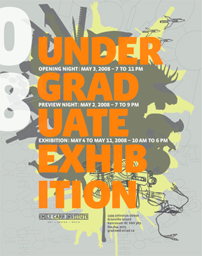
Saturday night I attended the ever-popular Emily Carr Undergraduate Exhibition, more commonly referred to as the “grad show” among my peers. There is some stellar work there, as always, and I strongly encourage anyone interested in art, communication design, industrial design, film or animation to get down there in the coming week and see the work of this year’s group of 350+ talents.
The show runs for a shorter period this year so you only have until this coming Sunday the 11th to see it for yourself! The show is open 10 am to 6pm at Emily Carr Institute, 1399/1400 Johnston St. on Granville Island. More info »
For myself and my class, today marks one year since our graduation and grad show… how time flies! The feeling walking to the show opening on that perfect sunny evening and the energy of the night itself has a nostalgic magic.
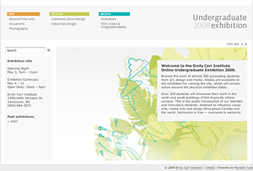
This year I helped put out the grad site again but with a much different set of roles. The student volunteers and coordinating faculty gave a tremendous effort; many thanks and congratulations go out to them for producing a fabulous grad 2008 website!
Note that many projects showing at the school are not on the website, and vice versa. This is particularly true of design projects which were not yet complete at the time of submission. So do visit the show, pick up a printed catalogue, and check out the website. Enjoy!
