
How can responsive retrofitting benefit your business or organization?
The increasing prevalence of smartphones and tablets has dramatically changed how people access the internet, to the extent that a statistic from last month is out of date today. As a consequence, people — rightly — have the expectation that your website will be easy to read and navigate on their iPhone or Nexus tablet. At best, a website not optimized for an experience on a smaller, touch-based screen will frustrate the visitor but they’ll complete their task (contacting your organization, finding your opening hours, or buying an item for example). At worst, they’ll give up and take their fingers — and business — elsewhere.
Some convincing math on mobile
There are many ways in which having a mobile-friendly website helps your business or organization meet or exceed its goals, not the least of which is making it easier and faster for people to buy your products or complete a petition. But if you’re not convinced there’s a critical mass waiting to look you up on their phone, here’s one juicy fact: an Internet Trends 2013 report shows that 15% of all traffic on the Internet worldwide is now on mobile, and projected to grow 150% per year. That number, of course, may vary for your site; sites I’ve worked on this year are achieving upwards of 20% mobile traffic. If a lot of your traffic comes via email or social media, changes are those numbers are higher.
A usable, well-designed website also reflects well on your brand. How well? A Latitude study (PDF) from last year states that “61% of people have a better opinion of brands when they offer a good mobile experience.” And of British Columbian adults surveyed by Insights West, “79% expect a good mobile experience from the brands they trust.” Does your website meet those expectations?
Responsive retrofitting, a great interim solution
If you’re not in a position to build a new website but your mobile experience is non-existent, responsive retrofitting could be a great interim solution for you until a new website is built down the road. Responsive means the design is flexible and adapts fluidly to multiple screen resolutions. (This is important when screen dimensions vary so widely.) This is achieved solely with CSS, which is able to target different screen resolutions. When a website is retrofitted, mobile-specific changes are made using CSS to optimize the site to different screen resolutions without touching its HTML structure, or doing so only minimally as necessary. I retrofitted this site for smartphones (compare my portfolio to my blog on a smartphone to see the difference as of this date) as well as the David Suzuki Foundation‘s website (not finished).
Responsive retrofitting is a lower-cost way of offering your valuable visitors a better mobile experience while avoiding the pitfalls of a separate mobile site. Once you’re ready to have a new site designed and built at a later time, you’ll have a better idea of what your visitors need when they use your website on a phone or tablet.
Let’s work together
I love building usable websites that help your visitors easily and quickly find what they need, on any device. Let’s talk about how I can help you — Get in touch today to talk about a responsive retrofit or a new build. Not sure which one you need? I can help you figure that out, too.
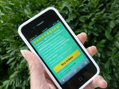
Take a look at sites I designed and built to be responsive from the start, Vecova Beverage Container Pick-Up and Practivism. Adjust your browser window or load it up on a mobile device to see it in action.