Business cards
Business cards
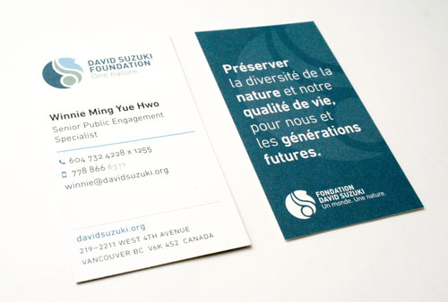
The David Suzuki Foundation’s new business cards were designed to tell the brand story on one side — perfect for people unfamiliar with the national non-profit — and present neatly organized, easy to read contact information on the other. Icons help distinguish between office and mobile phone numbers. A less conventional, vertical format allows for plenty of room for information and the mission statement on the back in one or both languages. And the solid colour on the back helps distinguish the cards from others in a stack.
The idea to include the mission on one side came out of a process, while I was on staff, of defining an elevator pitch and helping staff easily articulate it when they meet people. Having it on the card makes it both accessible in a pinch and a good carry-away for the receiver.
Cards templates were designed for three office locations in English or French, and one bilingual version. The new cards were met with praise by staff.
More work

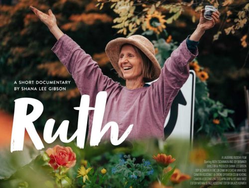
“Ruth” film poster
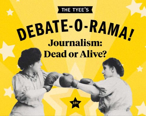
The Tyee’s Debate-o-Rama
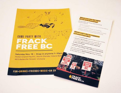
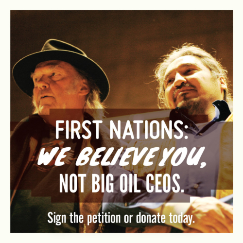
Frack Free BC action in Victoria

Newsletter redesign
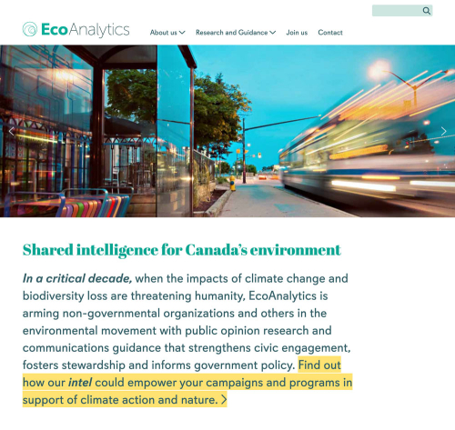
EcoAnalytics brand and website
Dogwood rebrand
Election campaign branding and material

Impact Assessment Act report

Salt Spring Island Climate Action Plan
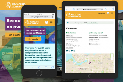
Recycling Alternative website

Let’s Go Biking book pages
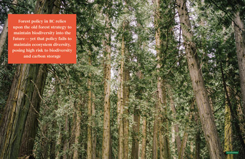
Report on BC’s old growth forest

Columbia Institute website

Building Bridges for Climate Action
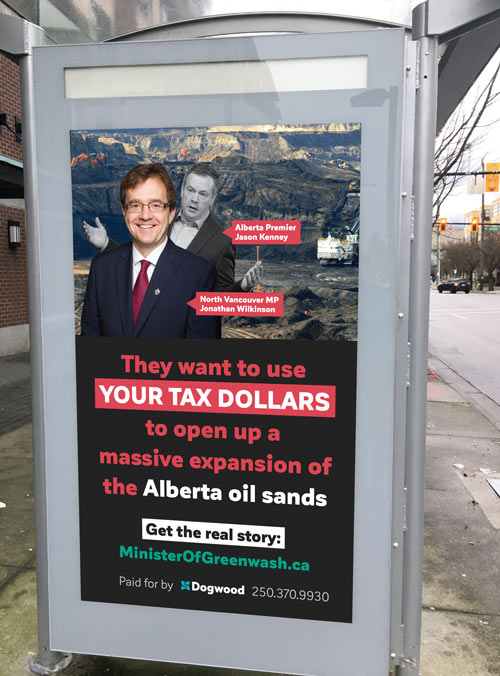
Minister of Greenwash ad

Climate election guide

The Run newsletter and ads
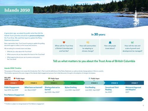
Islands 2050 open house boards
Dogwood Annual Reports

Campaign branding and collateral

Political ad

Postcards
Ecotrust annual report
Climate of Change infographics
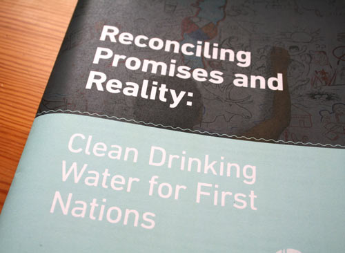
Reconciling Promises with Reality report
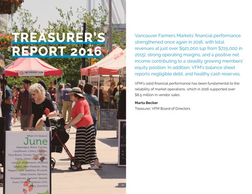
Vancouver Farmers Markets 2016/17 annual report

Climate of Change & Shades of Green reports

Buy Local farmers’ market campaign
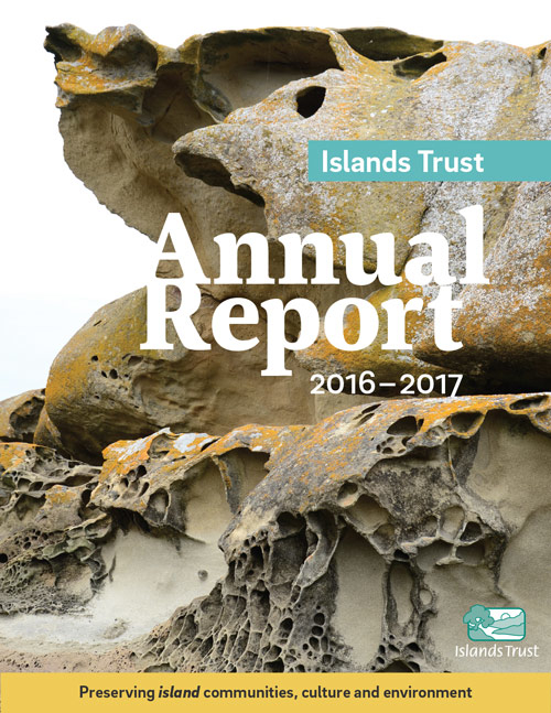
Islands Trust identity redesign
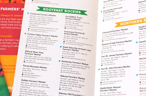
BC Farmers’ Market Directory

Promoting accessible books

Nutrition coupons

Ban Big Money + Vote BC promo
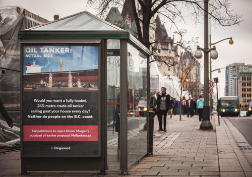
No Tankers bus shelter ads

Farmers Appreciation Week
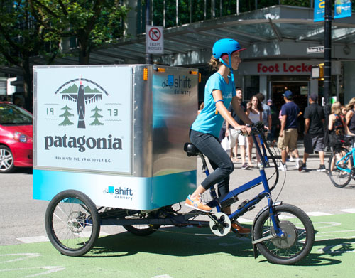
Trike wrap

Dogwood campaigns
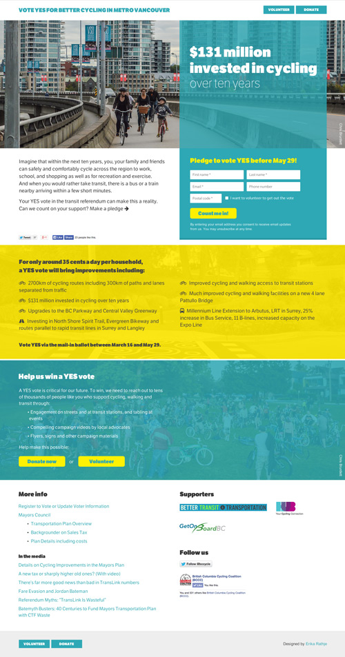
Vote yes for better cycling and transit